
PROJECT DESCRIPTION
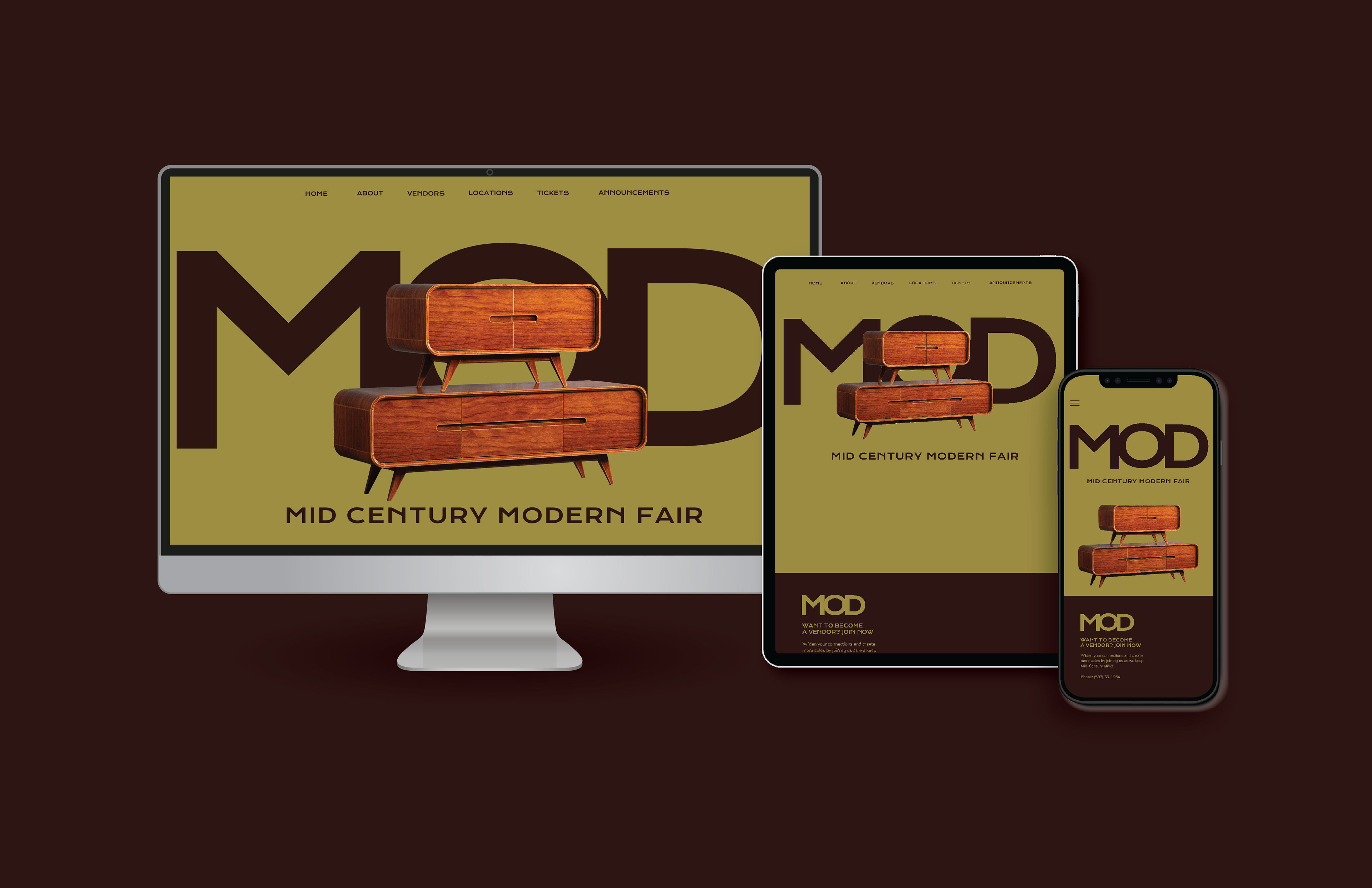
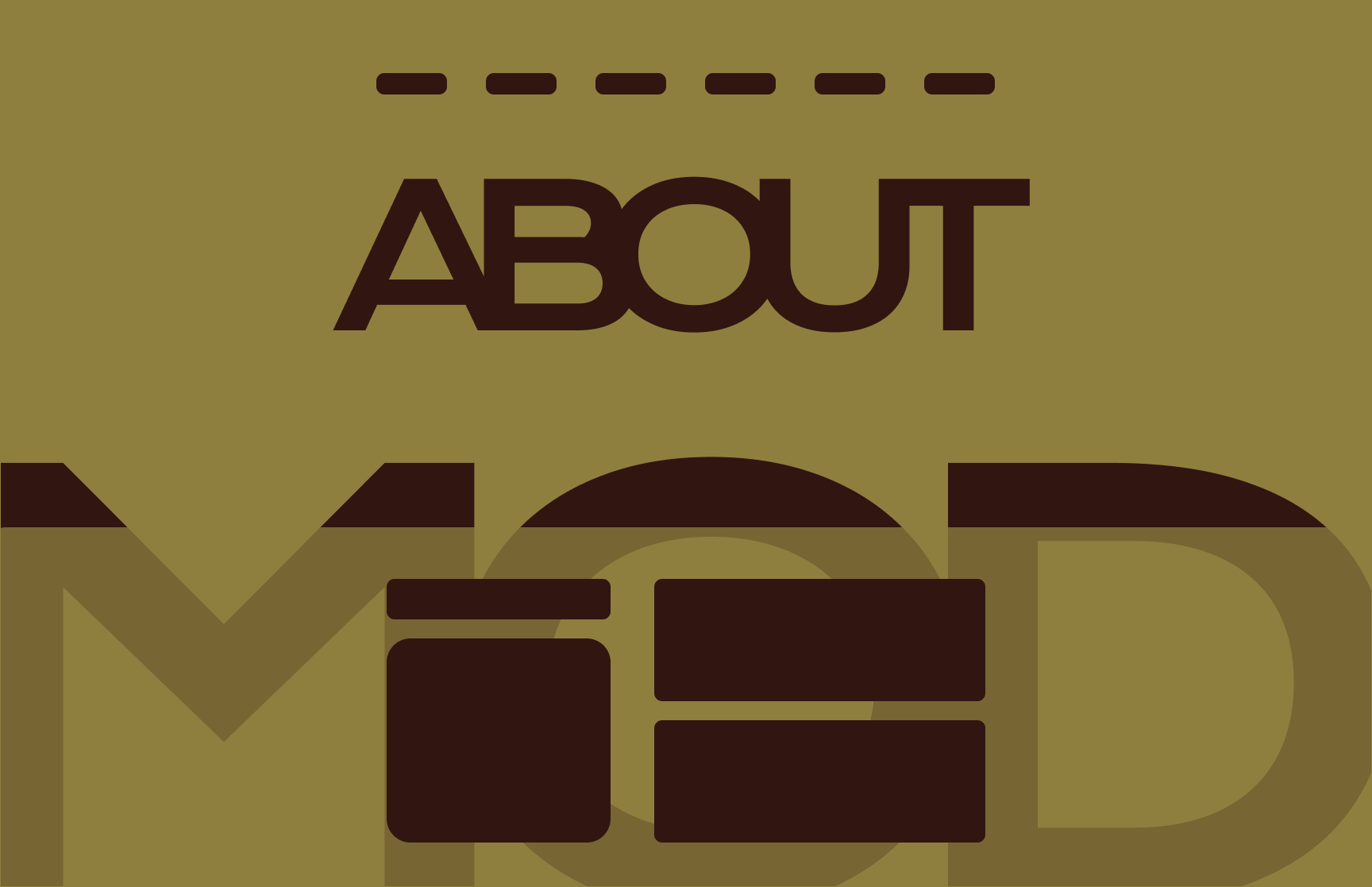
The project involved creating a responsive website for a fictional event of my choice, consisting of three working pages: a home page, an about page, and a third page of my selection. My responsibility was to design each page to effectively communicate the event's purpose and features. I applied my knowledge to integrate a cohesive brand with its digital presence, emphasizing readability and accessibility. My goal was to produce a realistic depiction of the event, making it seem as if it could happen in real life.
LEARNING LENS
I chose a mid-century modern theme inspired by Cincinnati’s own mid-century modern fair. I wanted a name that clearly reflected the event without being too literal, so I settled on "Mod," short for “modern,” which is simple and memorable. While researching similar events, I found that there were few to no websites focused on interior design, so I had to start from scratch when it came to finding inspiration. I aimed for a brand that was easy to remember and aligned with modern website standards. Ultimately, I decided on a sophisticated, modern look, which worked in my favor.
FINAL SOLUTION
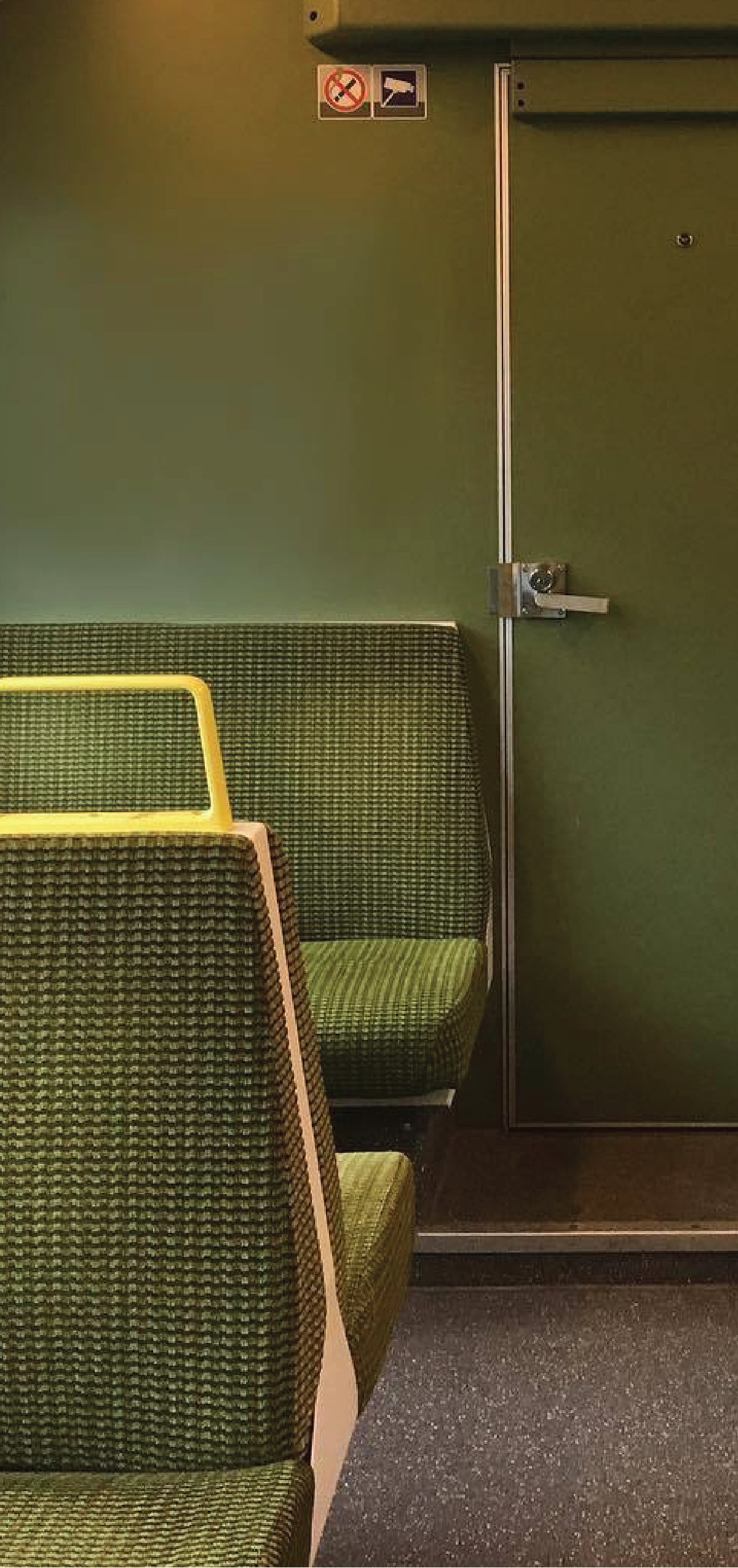
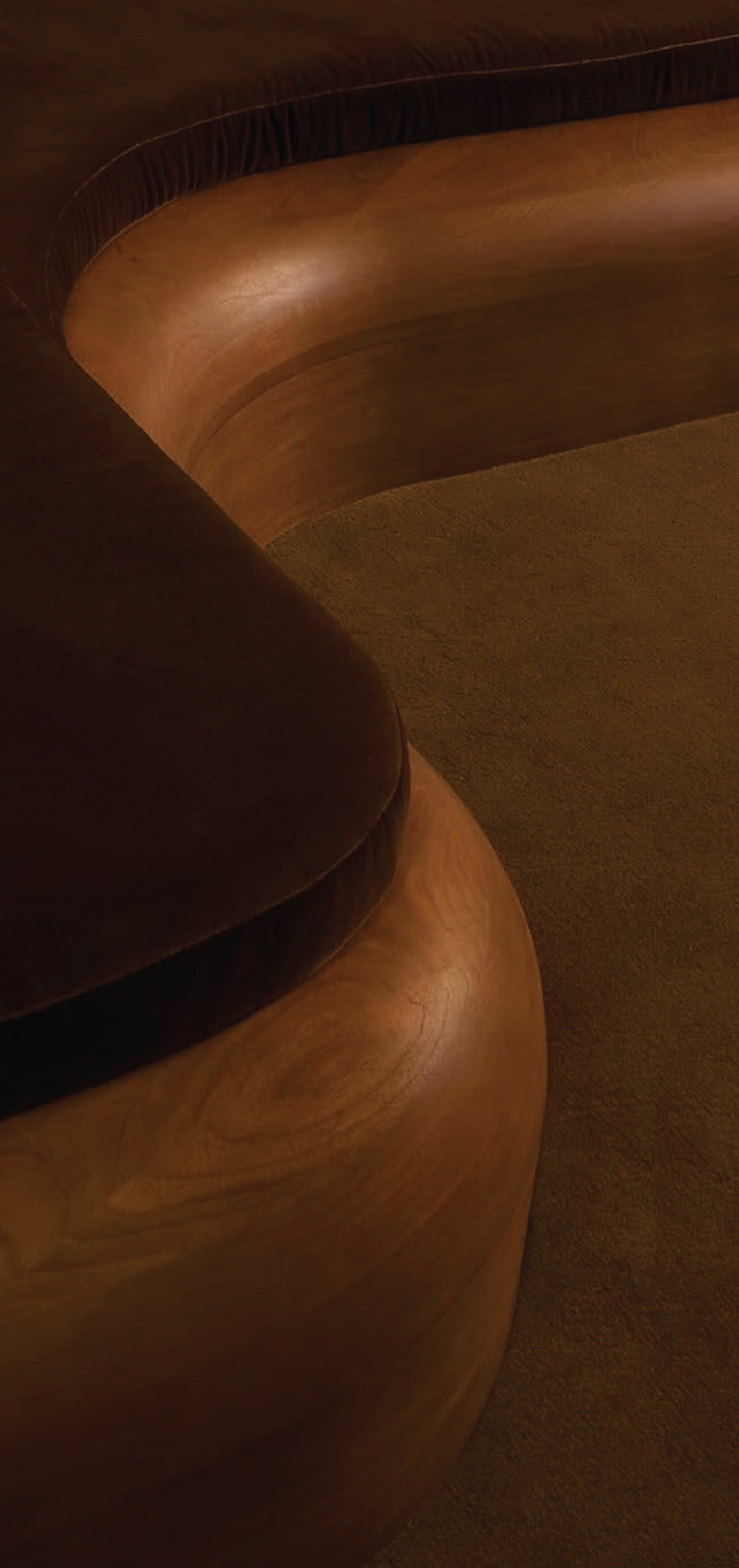
By combining the modern minimalism of today’s brands, I allowed the images of the events to take center stage next to the logo. Relying on only two colors — natural green and brown — it was easy on the eye and truly reflected the warmth and nature associated with this time in interior design. Working well for website readability and for showcasing each stand with images, this website effectively conveyed to viewers what this event would look like. It served as a digital preview of what was to come.