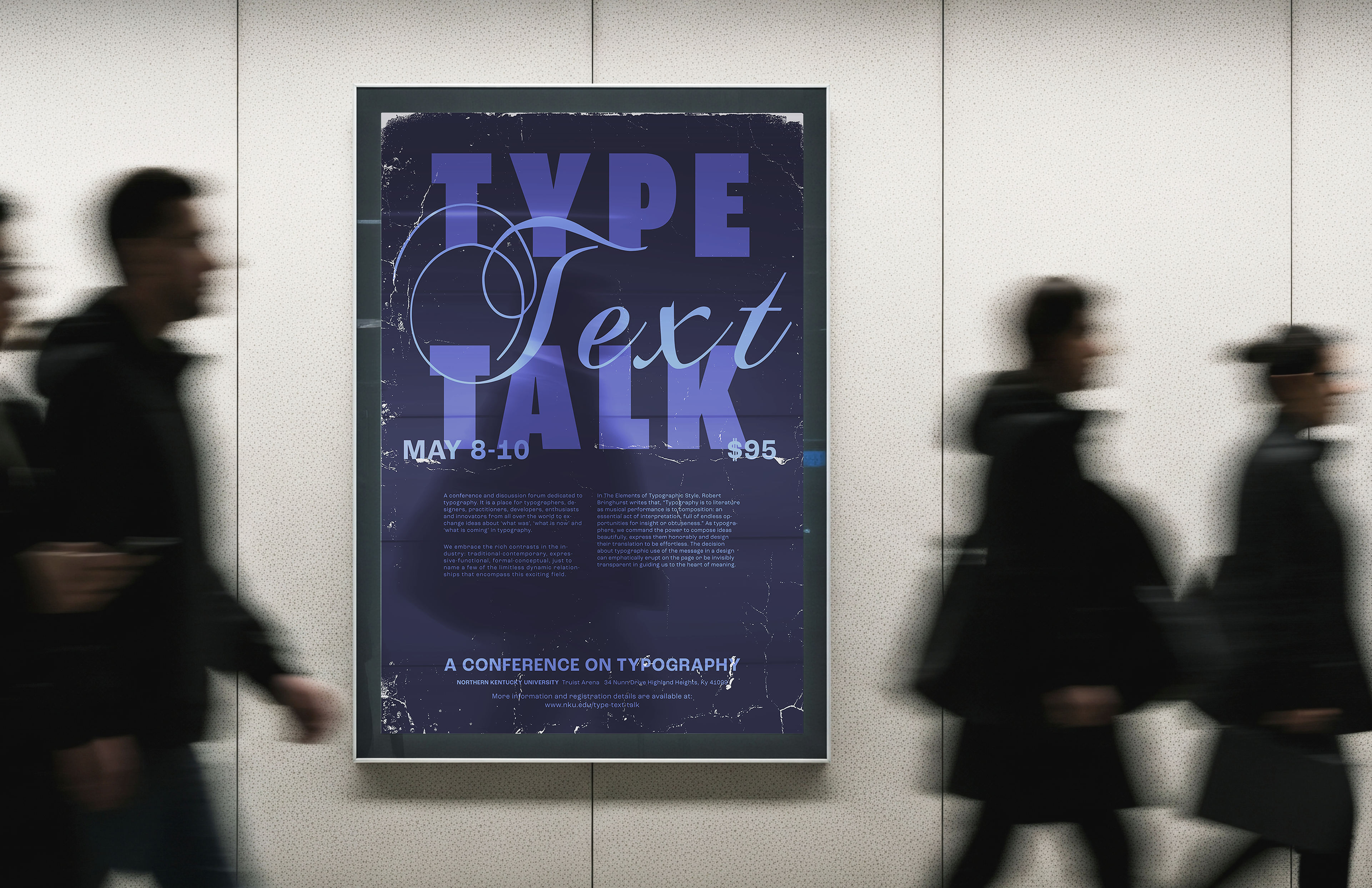
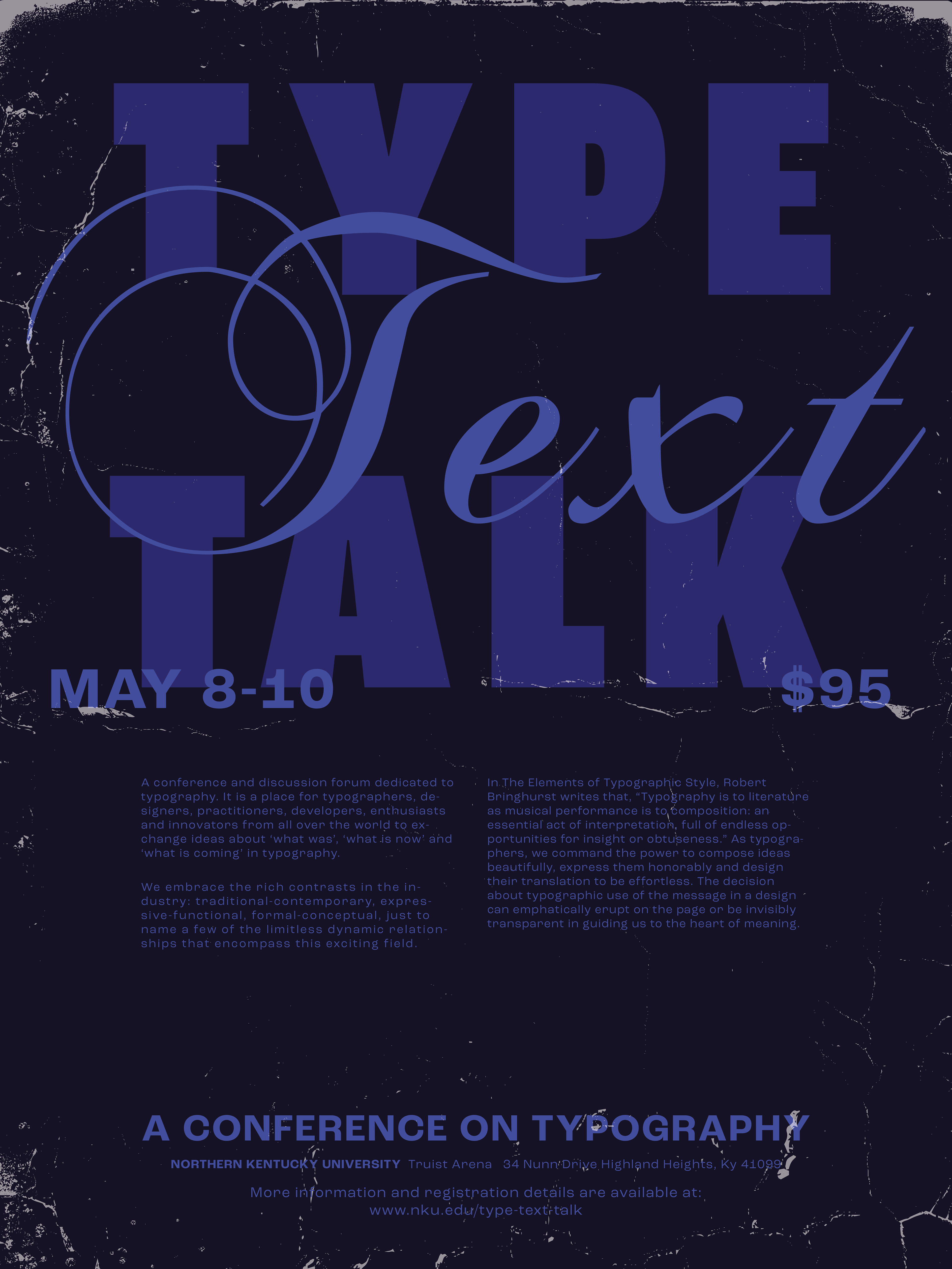

PROJECT DESCRIPTION
I was tasked with creating a two-sided promotional poster for a typography conference. Utilizing my typographic skills, I designed a distinctive poster that showcases various ways type can be used in design while providing access to additional conference information. The poster includes the title, dates, location, about, schedule, and descriptions. It needed to be clear, easily digestible, and reflect the conference's spirit.
LEARNING LENS
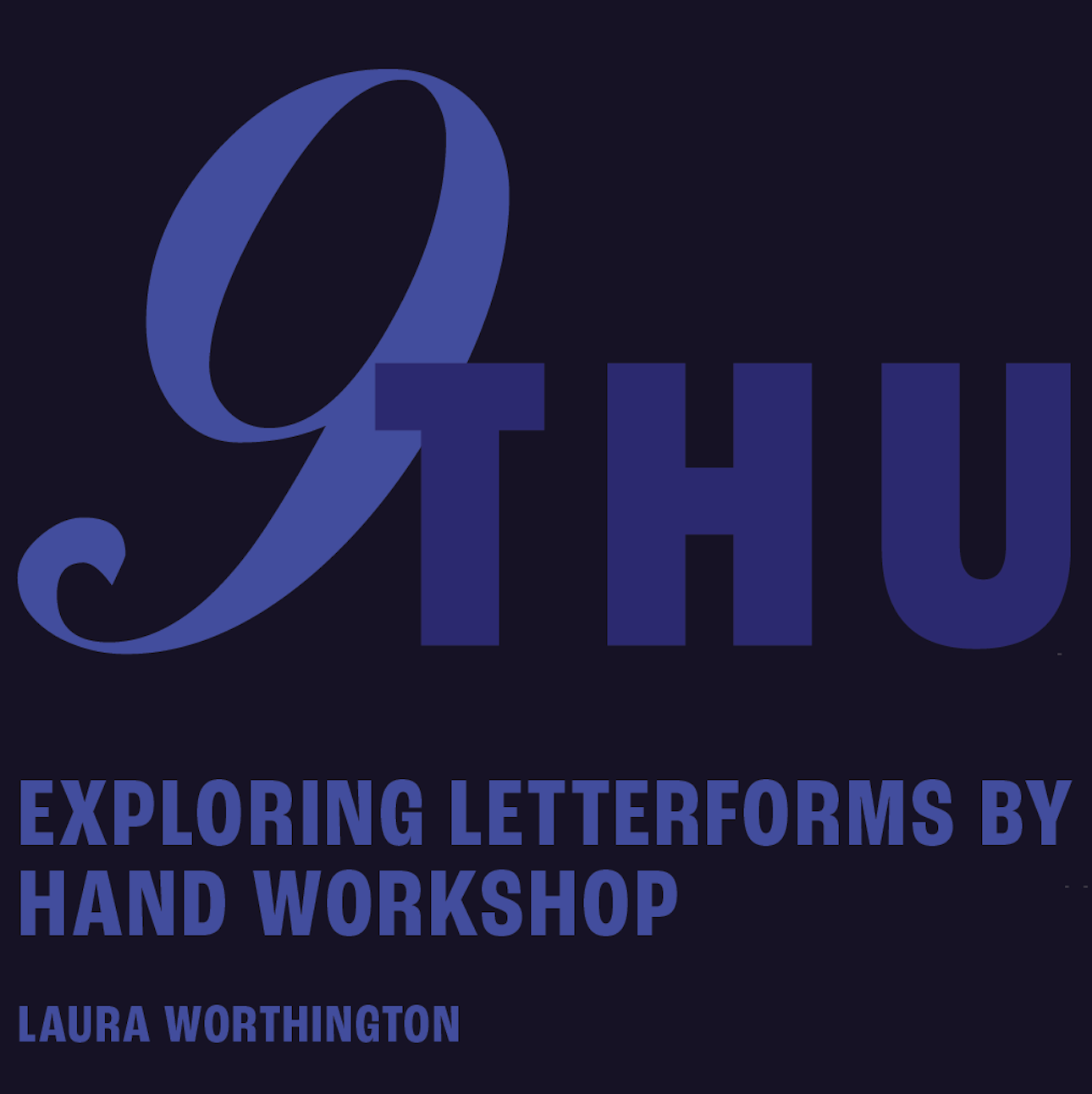
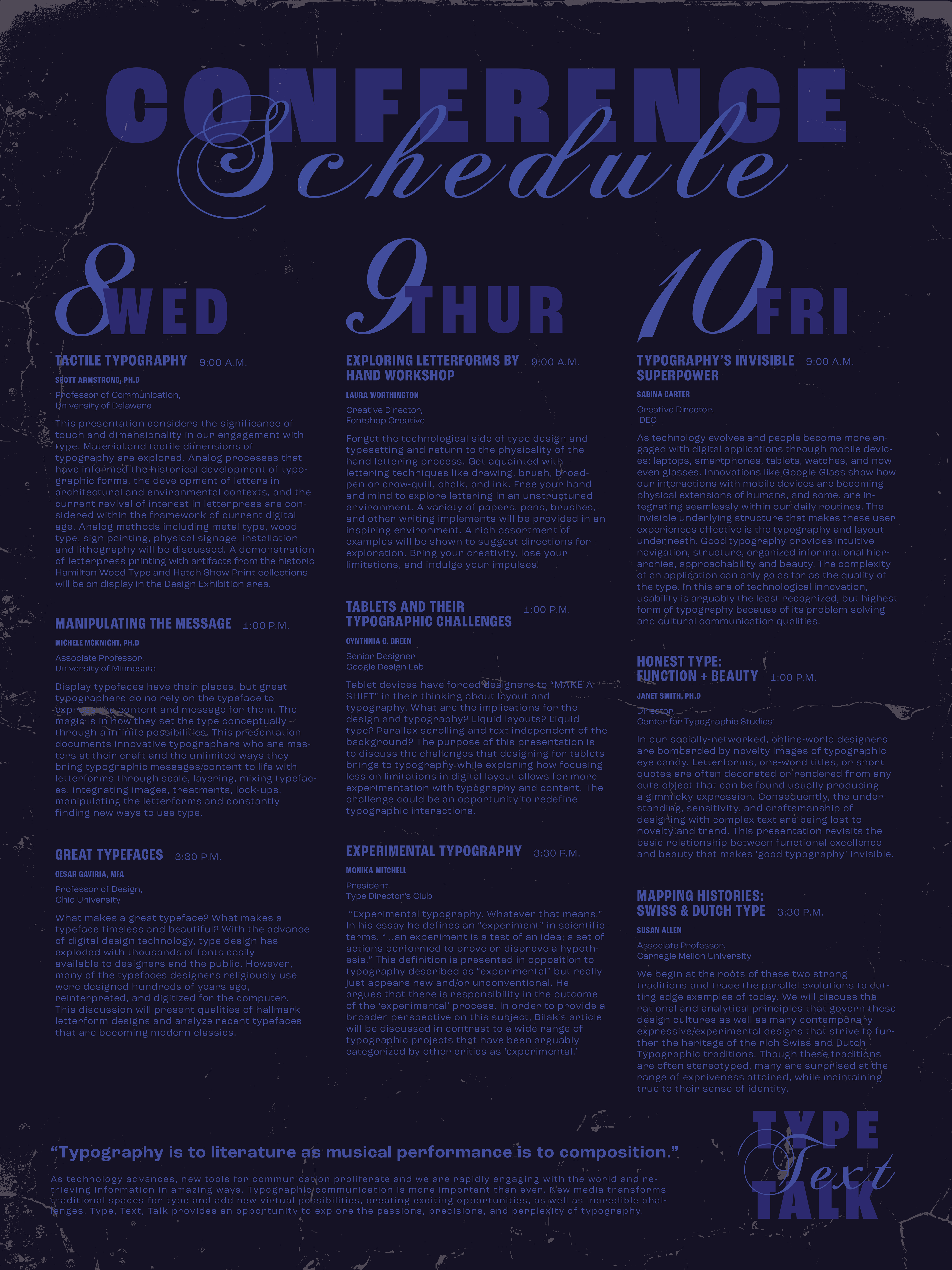
When working on this project, the primary challenge was designing a spacious and uncluttered poster that focused on scheduling. Inspired by research, I sought practical ways to present information through layout and presentation, aiming to make the poster stand out against our concrete surroundings. I experimented with various color palettes and textures that complemented each other. However, I realized my initial version lacked sufficient readability. Embracing minimalism, I focused on making the text both clear and visually appealing, keeping in mind that the conference centered on typography. Utilizing type creatively became a key strategy to enhance the design.
FINAL SOLUTION
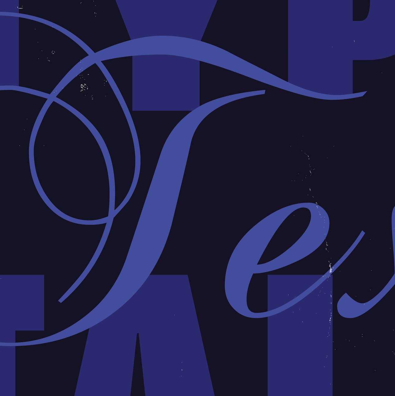
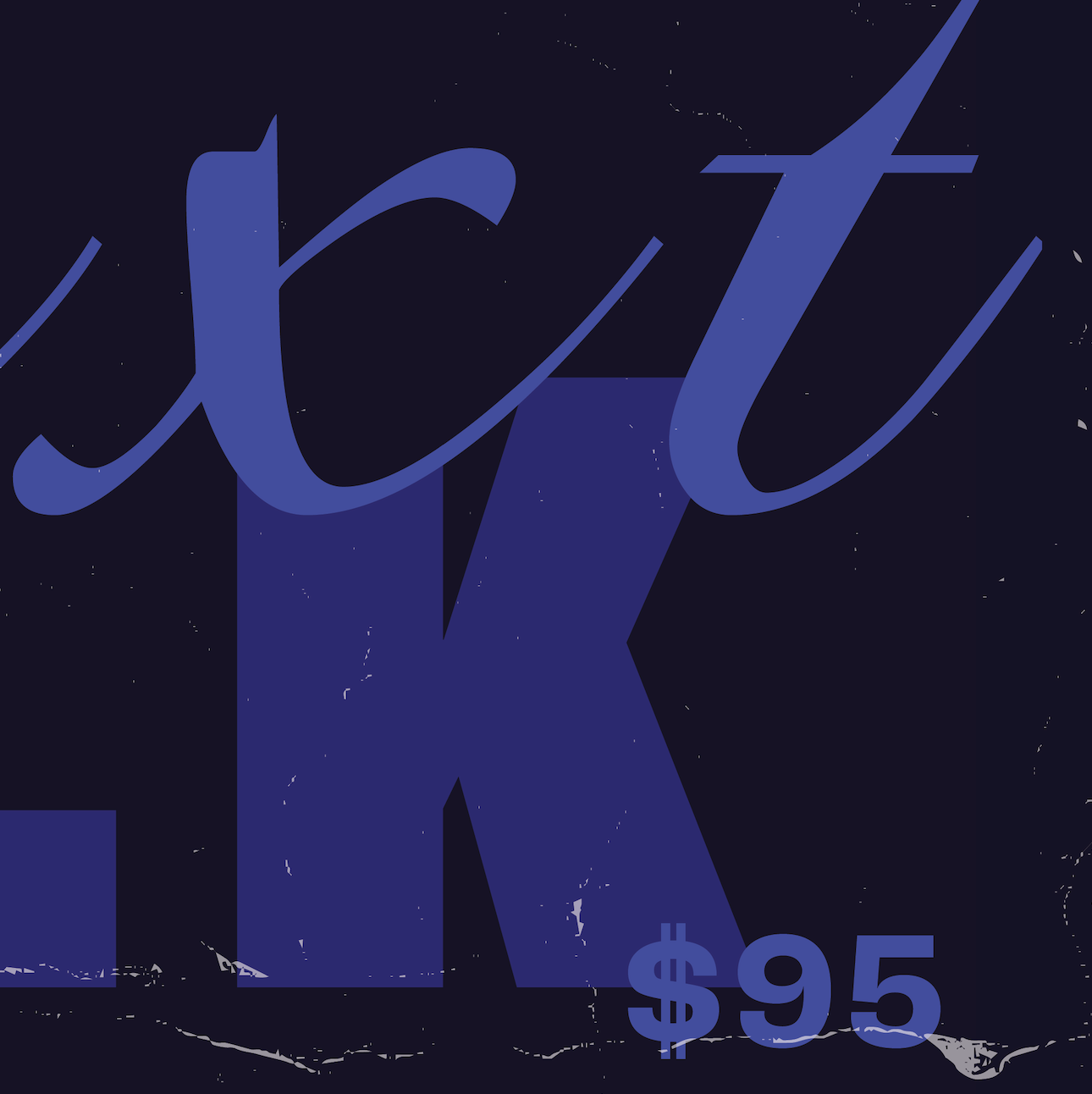
I aimed for a bold design that would showcase the type in various styles, since this was a typography conference. Although I adopted a maximalist approach, readability stayed a primary focus. Given the amount of information, I made sure my schedule layout was both easy to read and visually appealing. I achieved this by maintaining a grid-like structure and utilizing color, along with a diverse selection of typefaces, to balance the poster's boldness. I also maintained a cohesive look throughout so that each side clearly belonged together. It was a poster designed to be both engaging and informative.