
PROJECT DESCRIPTION
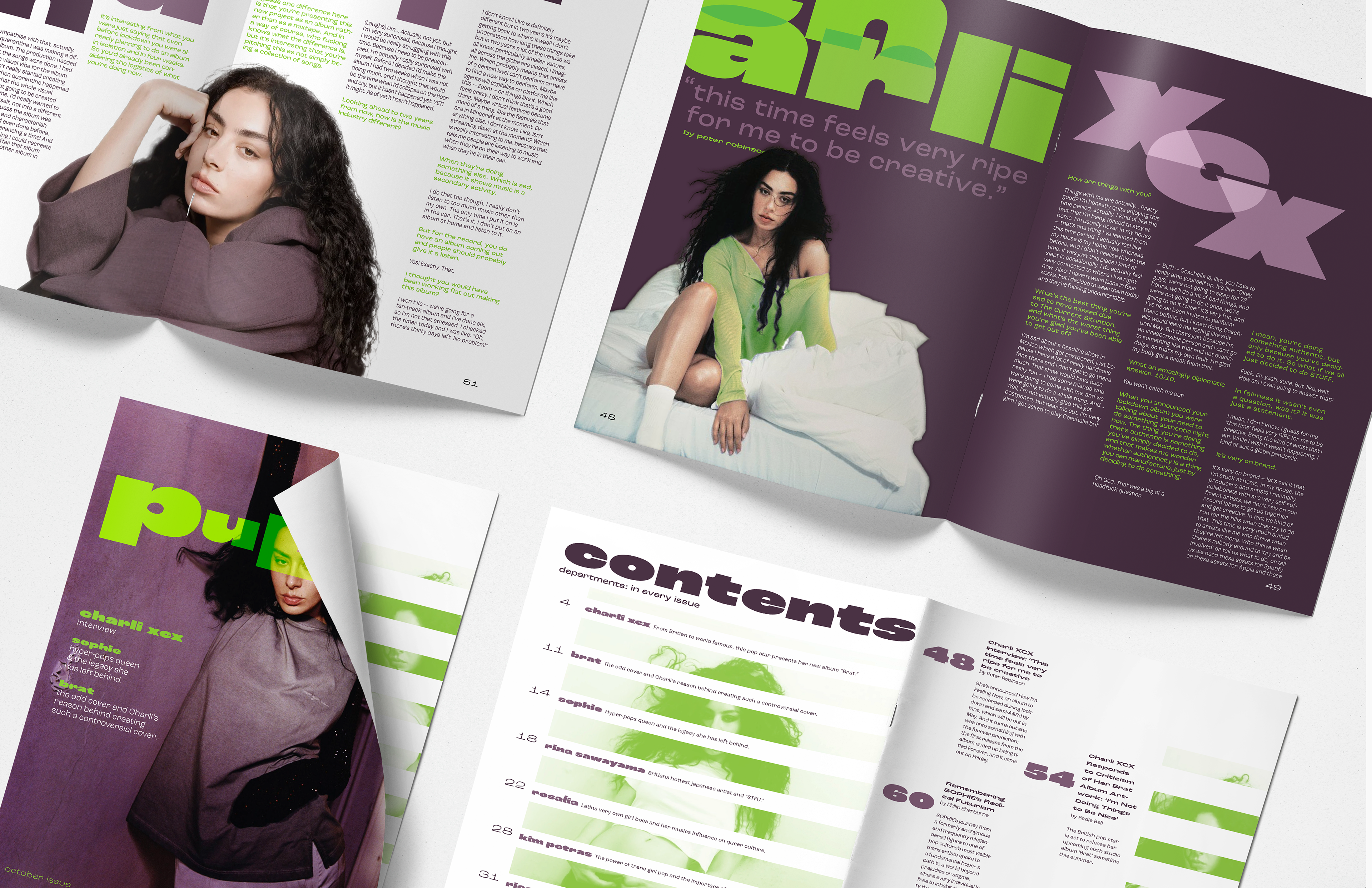
This project involved designing a three-page magazine spread, including a cover for a fictional magazine. It required creating a logo, a table of contents, one article, and establishing a cohesive brand identity. The article needed to be clear and engaging to capture viewers' attention. To achieve this, imagery and intentional typography were used to ensure all elements work together seamlessly, maintaining a consistent look throughout. The project aimed to demonstrate the practical application of typography skills while creating a visually unified and appealing magazine layout.
LEARNING LENS
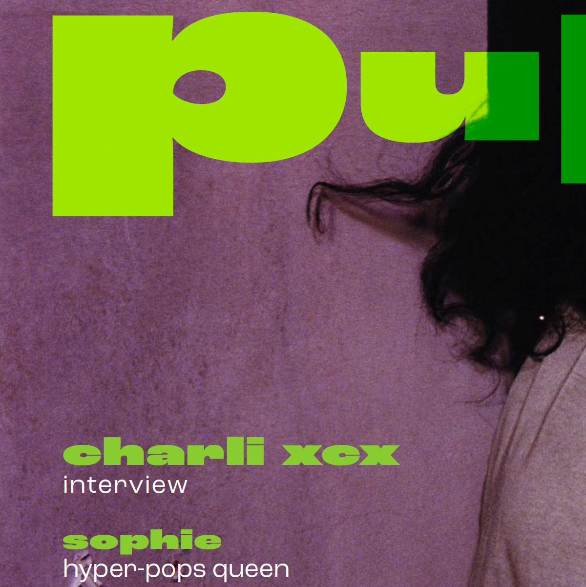
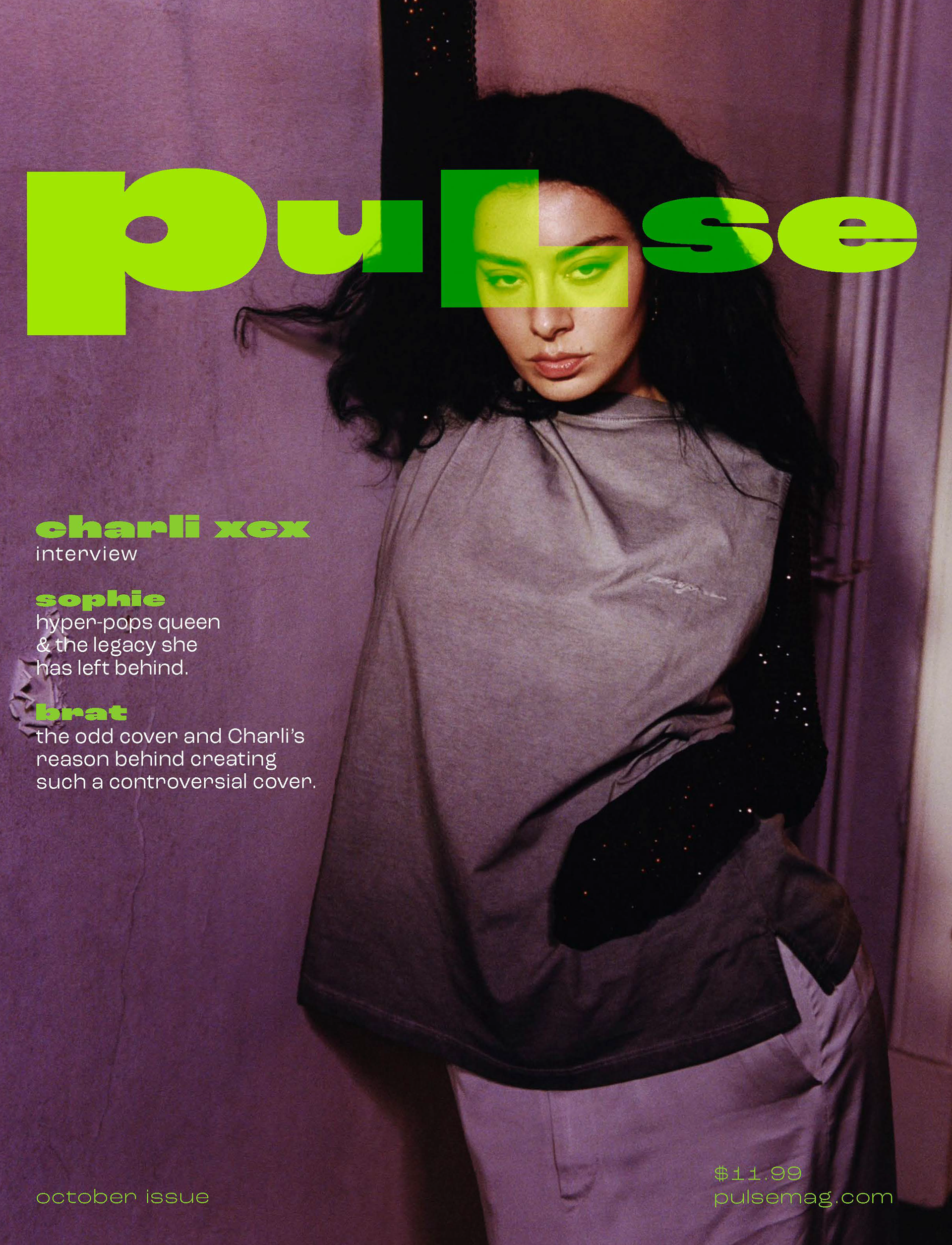
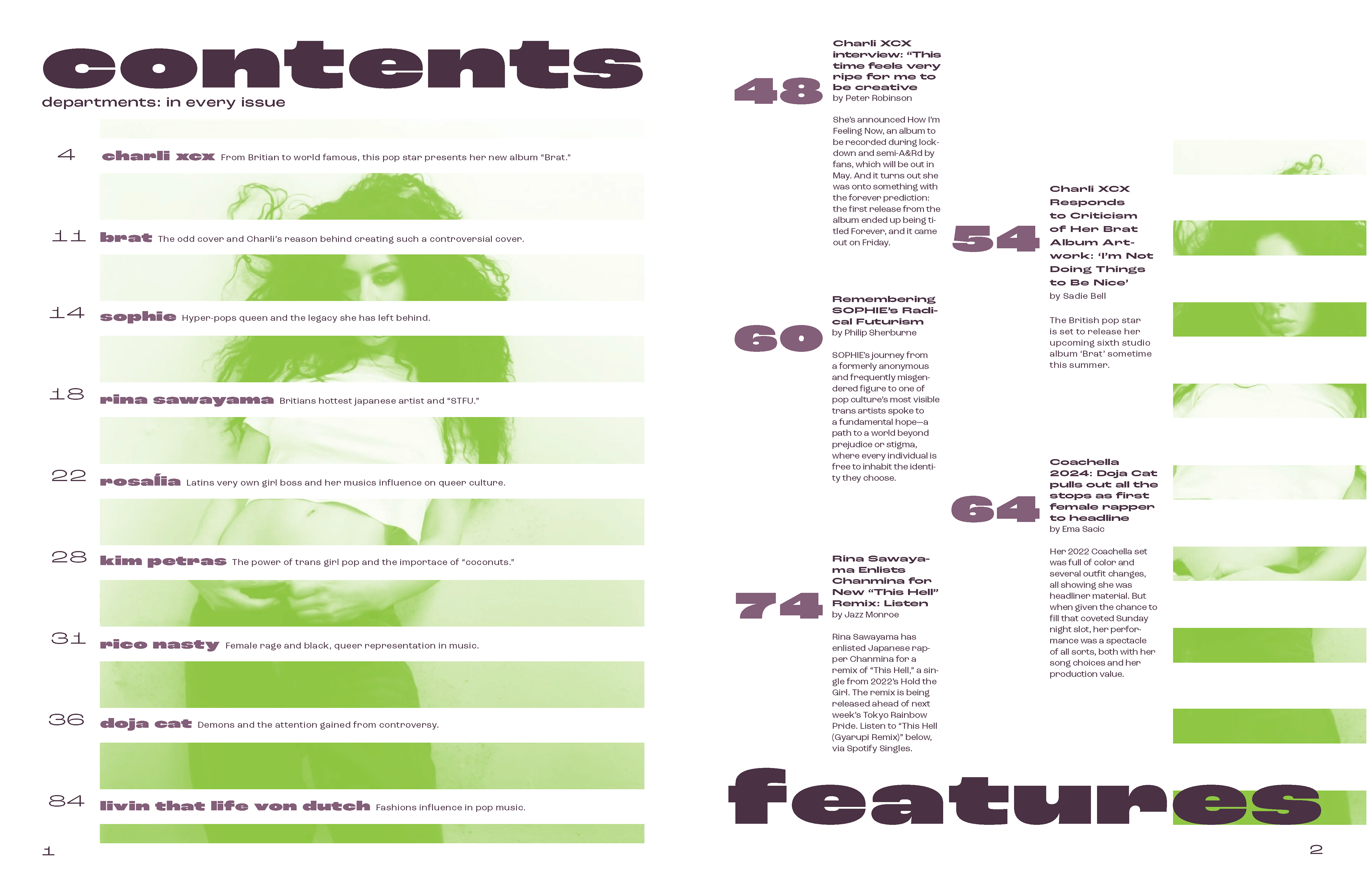
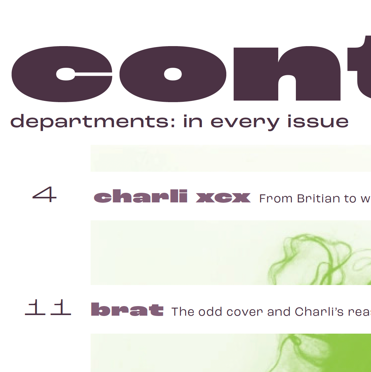
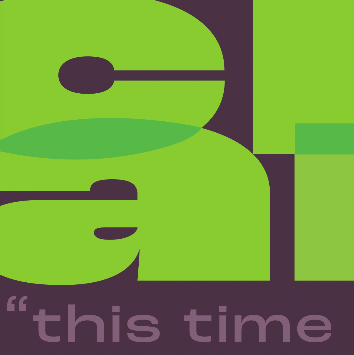
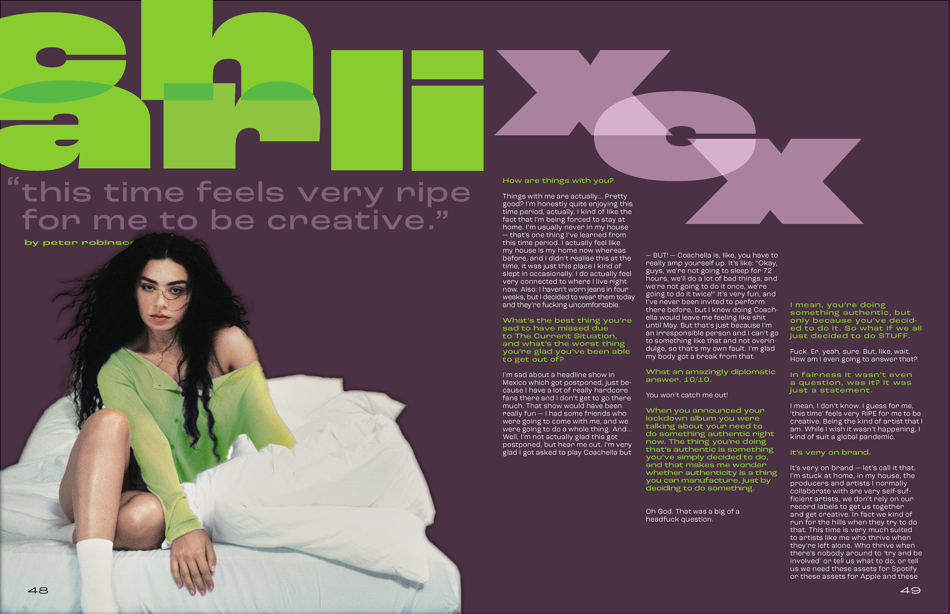
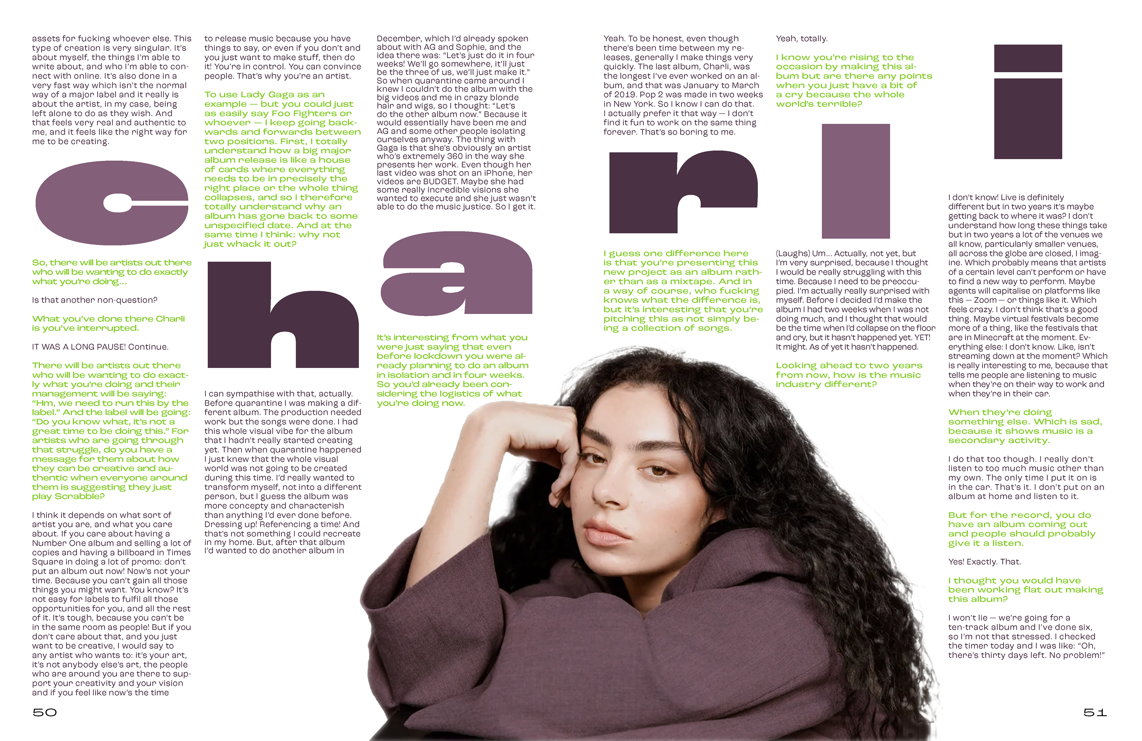
I initially considered “Armchair” as the magazine's title, but it didn’t fit the focus on dance-pop music. I chose ‘Pulse” to symbolize our heartbeat and BPM. Inspired by magazines like Dazed, Elle, Vogue, and Seventeen, I aimed for a look that appeals to late teens and adults in their 30s—those who enjoy party scenes and upbeat music. The layout of the interviews needed to be easy to read and flow well, while also making the content visually appealing. This approach helps create a vibrant, relatable magazine centered on energetic music and lifestyle.
FINAL SOLUTION
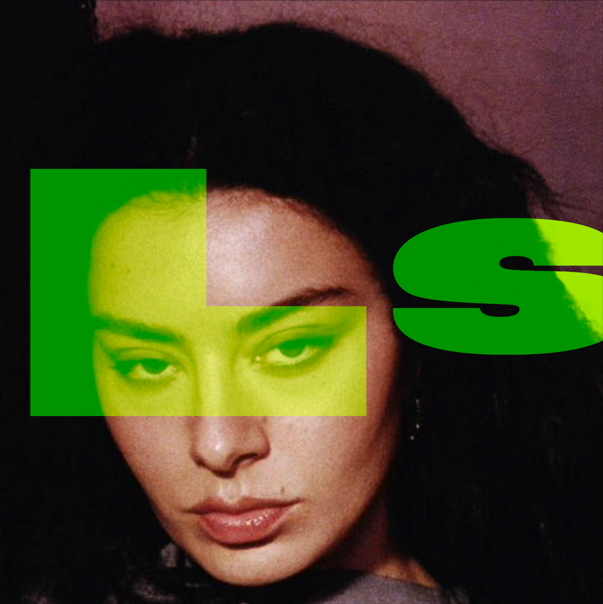
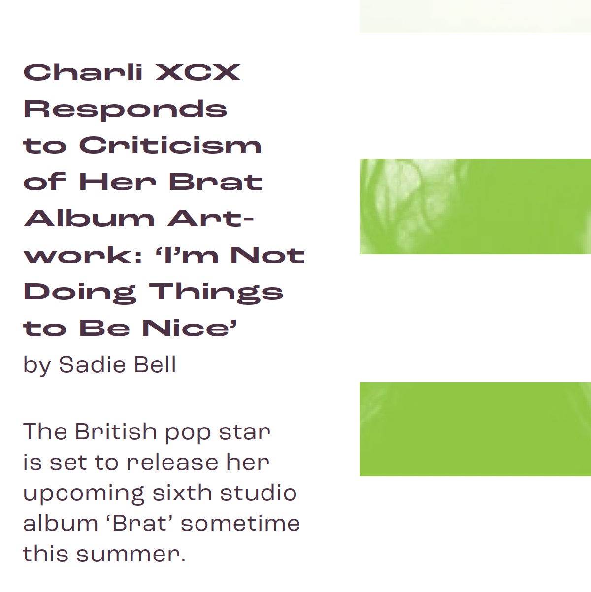
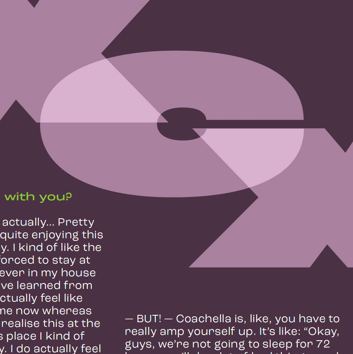
I chose Charli XCX as my interview subject because she embodied party culture and was releasing her album 'Brat' that year, which influenced the brand colors. For this issue, with neon green as the primary color, I selected a complementary plum hue to add dimension while keeping the logo type the focus. I combined playful and sleek fonts to create a modern look and designed the text to interact with images rather than follow a static grid, making the layout more dynamic and engaging.