PROJECT DESCRIPTION
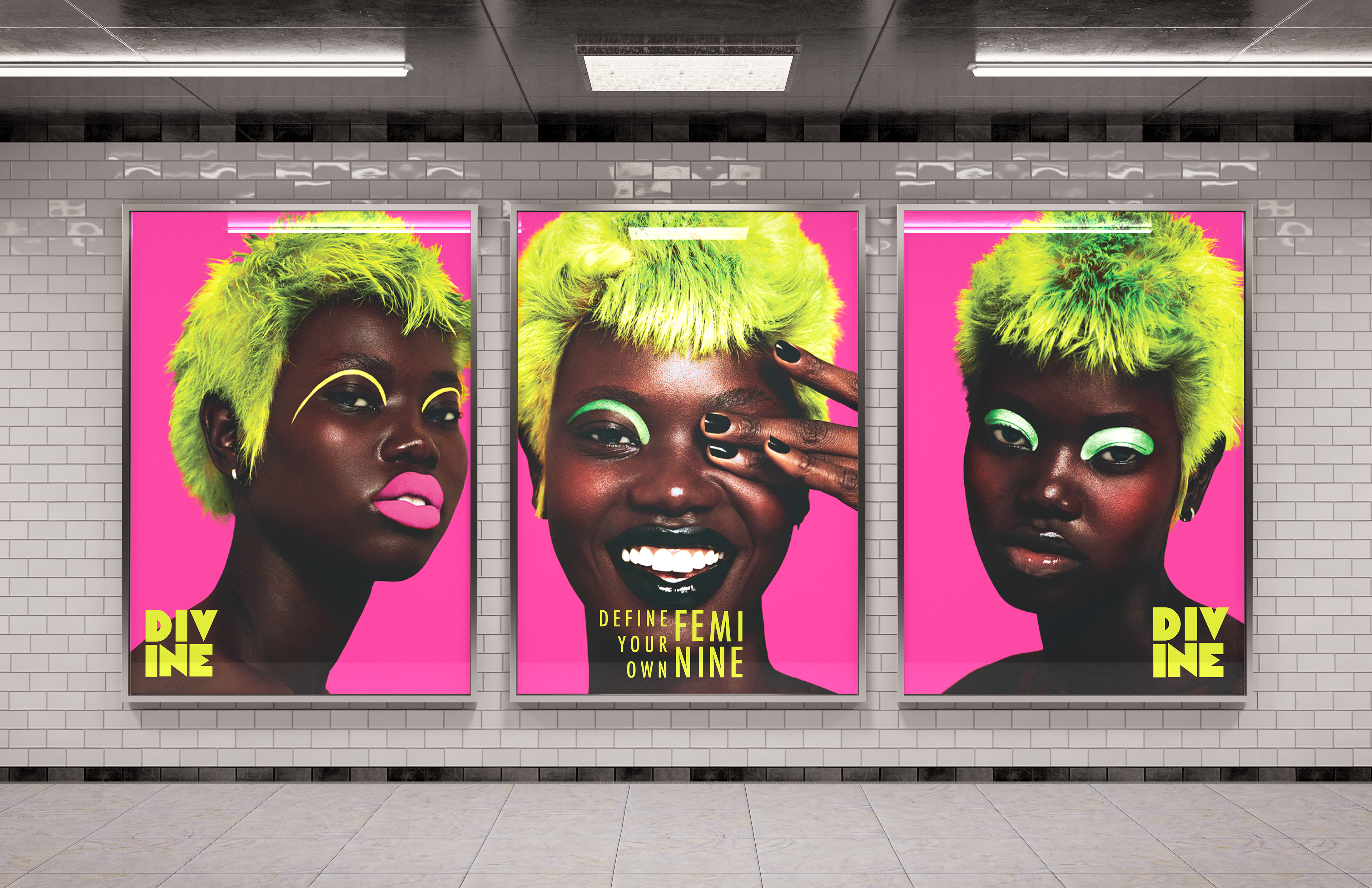
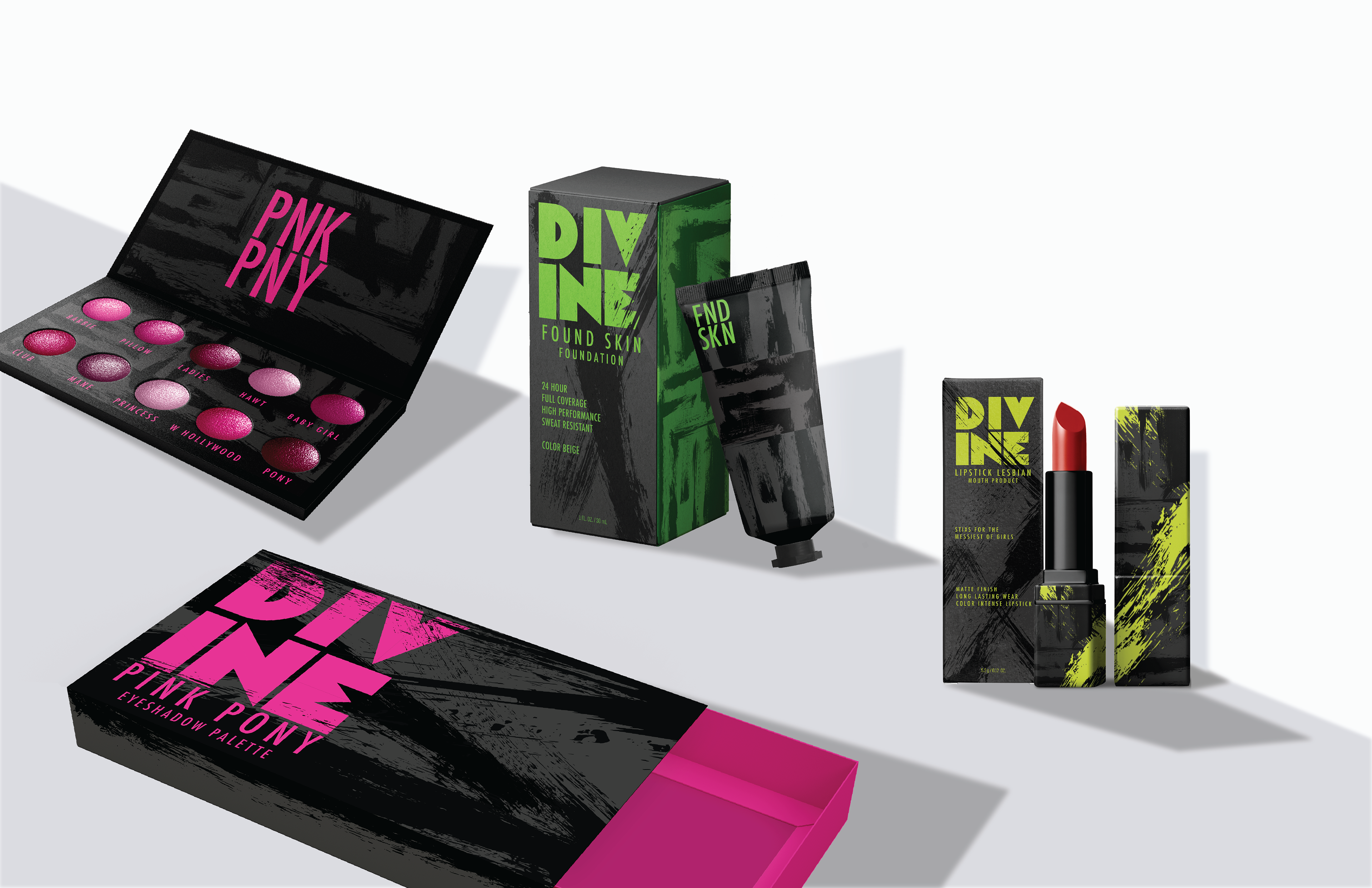
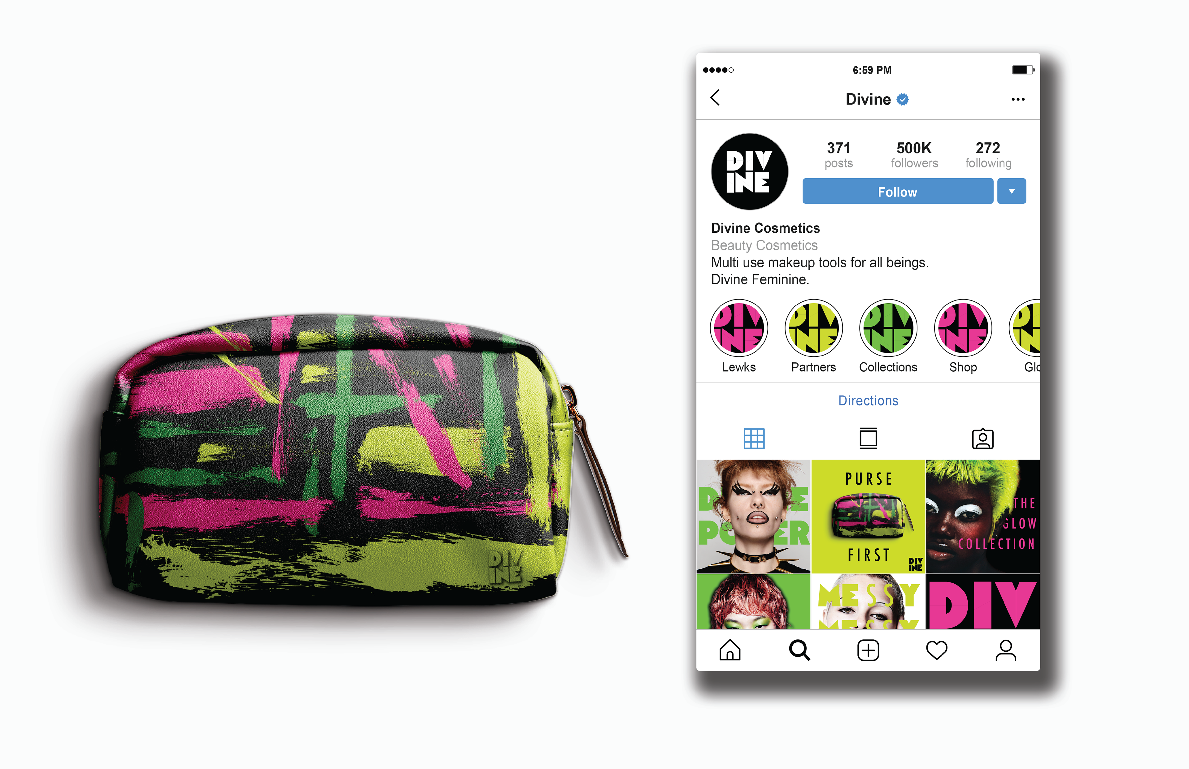
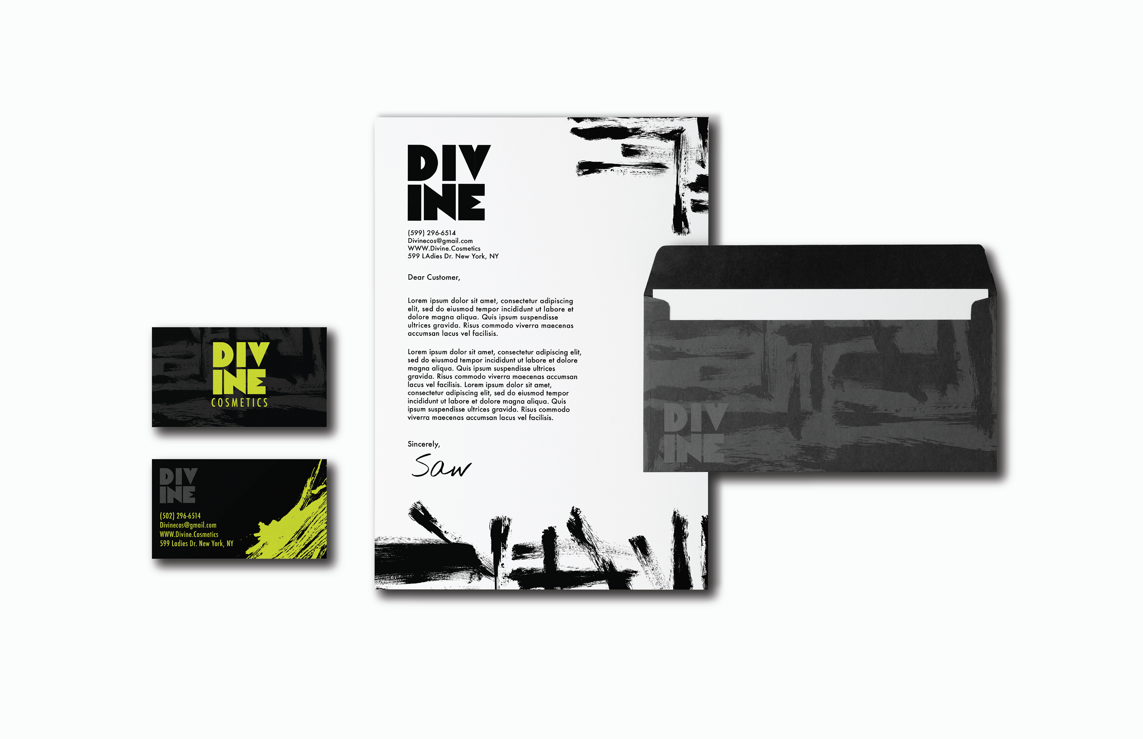
The goal was to develop a unique brand with three distinct packaging designs aligned with the product. Aiming to create a brand identity featuring a logo, color palette, target audience, and visual style. Each packaging type would serve as a promotional tool, usable in billboards, social media, and merchandising. The brand was designed to be purposeful and transparent about its target audience, offering something innovative and different.
LEARNING LENS
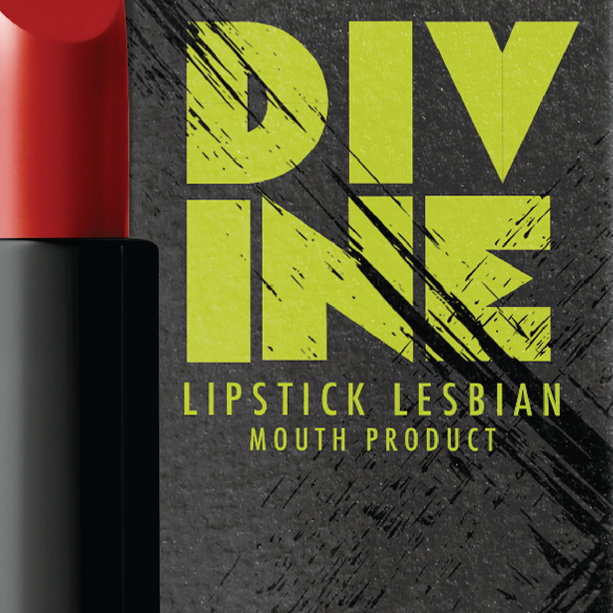
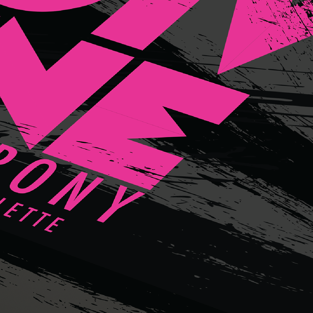
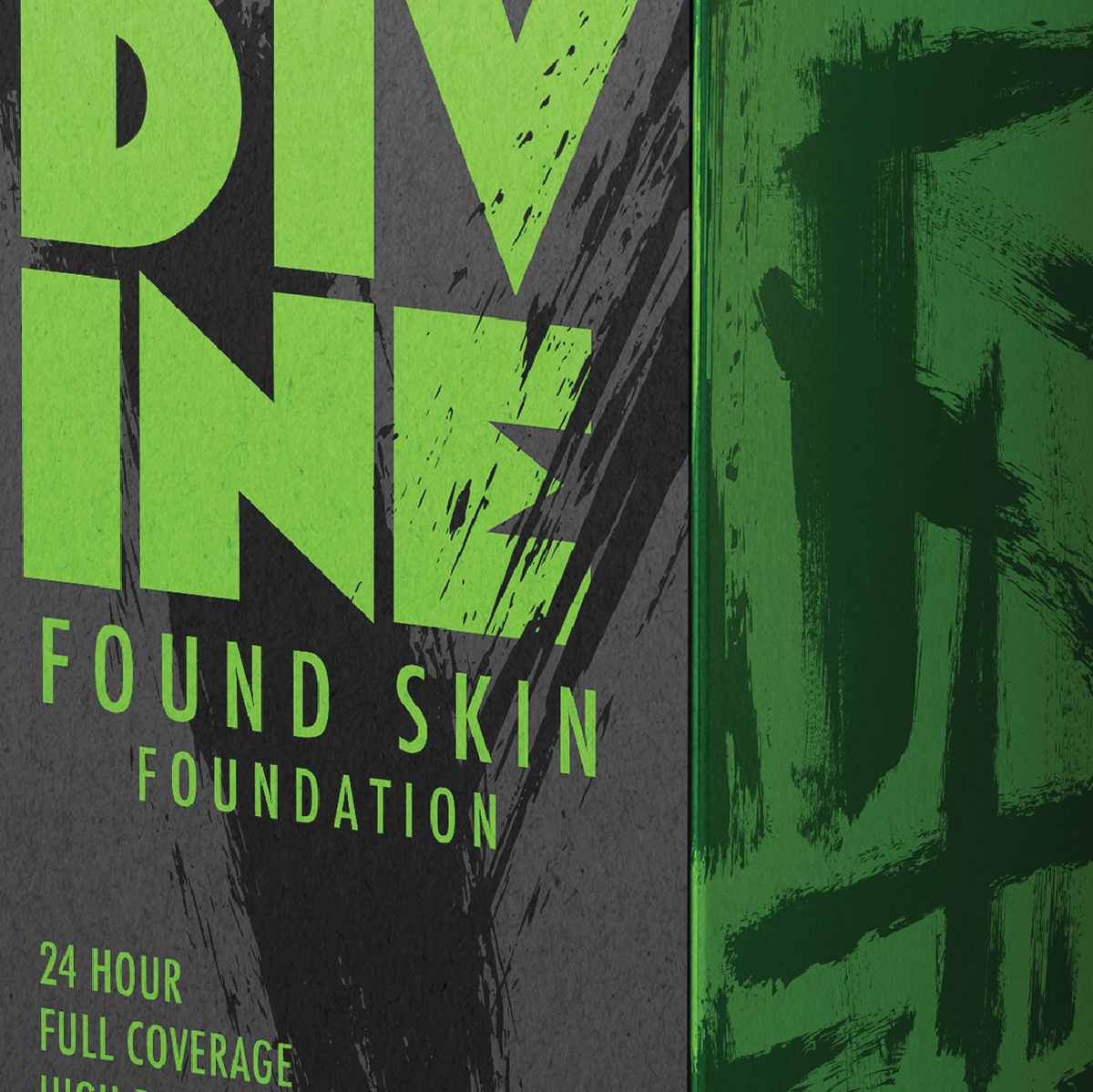
With experience in makeup and a focus on packaging and brand identities, I aimed to create a makeup brand rooted in artistic expression rather than traditional beauty standards. Extensive research revealed brands emphasizing subtle beauty, featuring soft colors and elegant imagery. In contrast, I sought a bold, intentionally messy aesthetic—utilizing vibrant colors, chaotic imagery, provocative names, and eye-catching packaging to make a lasting impression. Brands like About-Face, Fenty Beauty, Urban Decay, and KVD served as primary inspirations, guiding my vision to craft a brand that embraces chaos and boldness rather than conformity.
FINAL SOLUTION
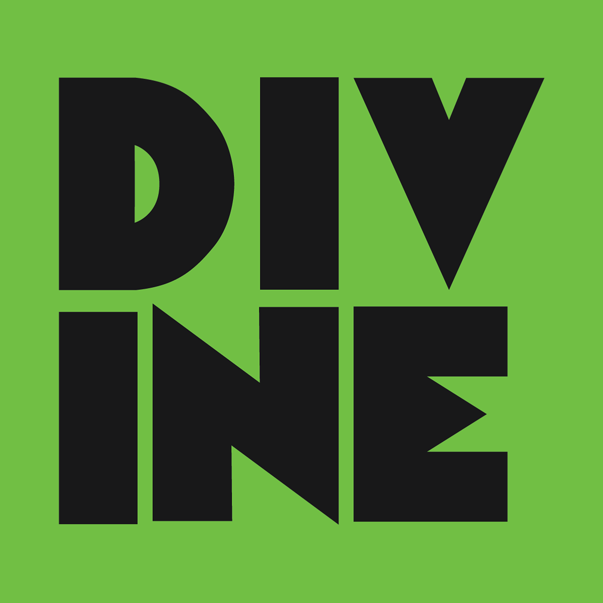
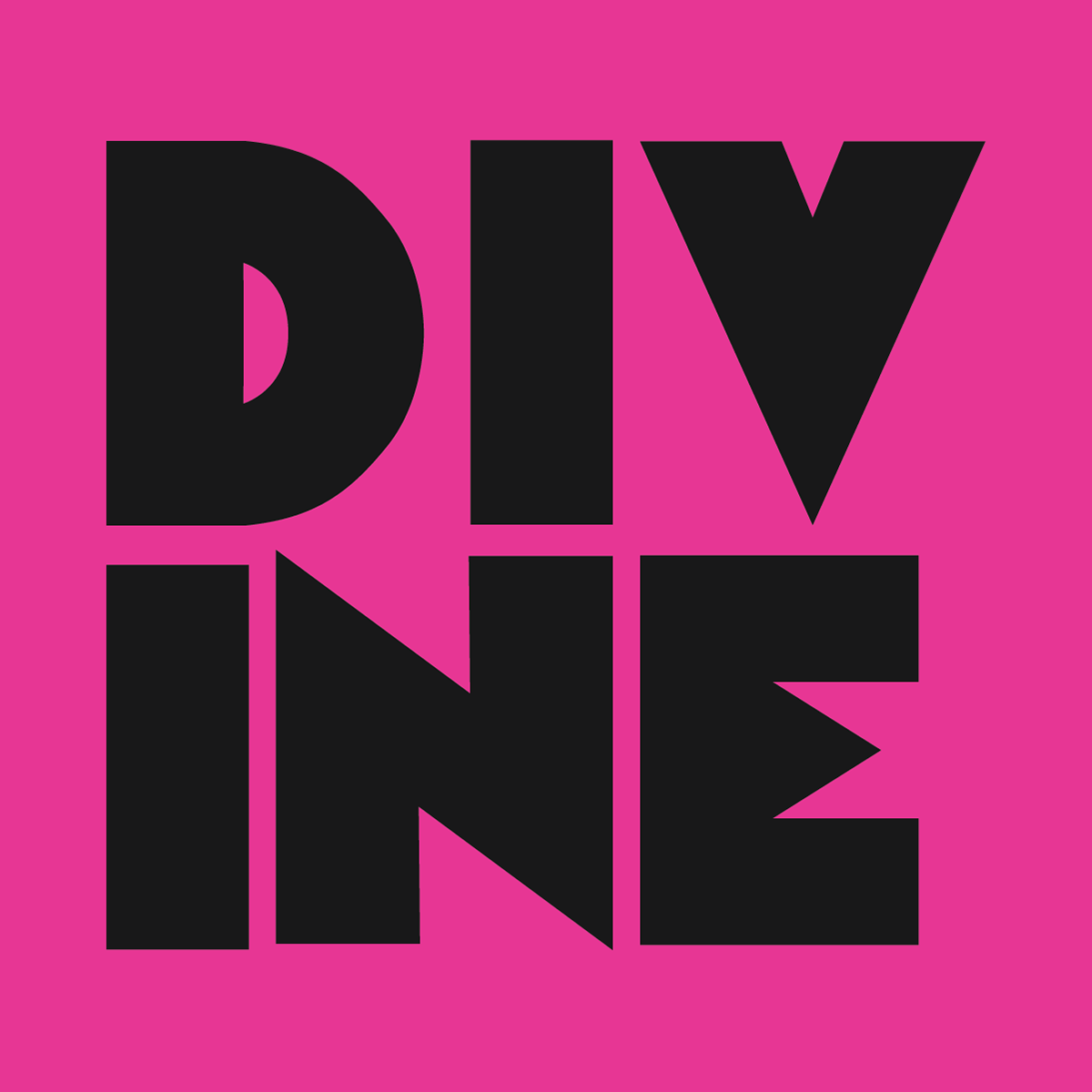
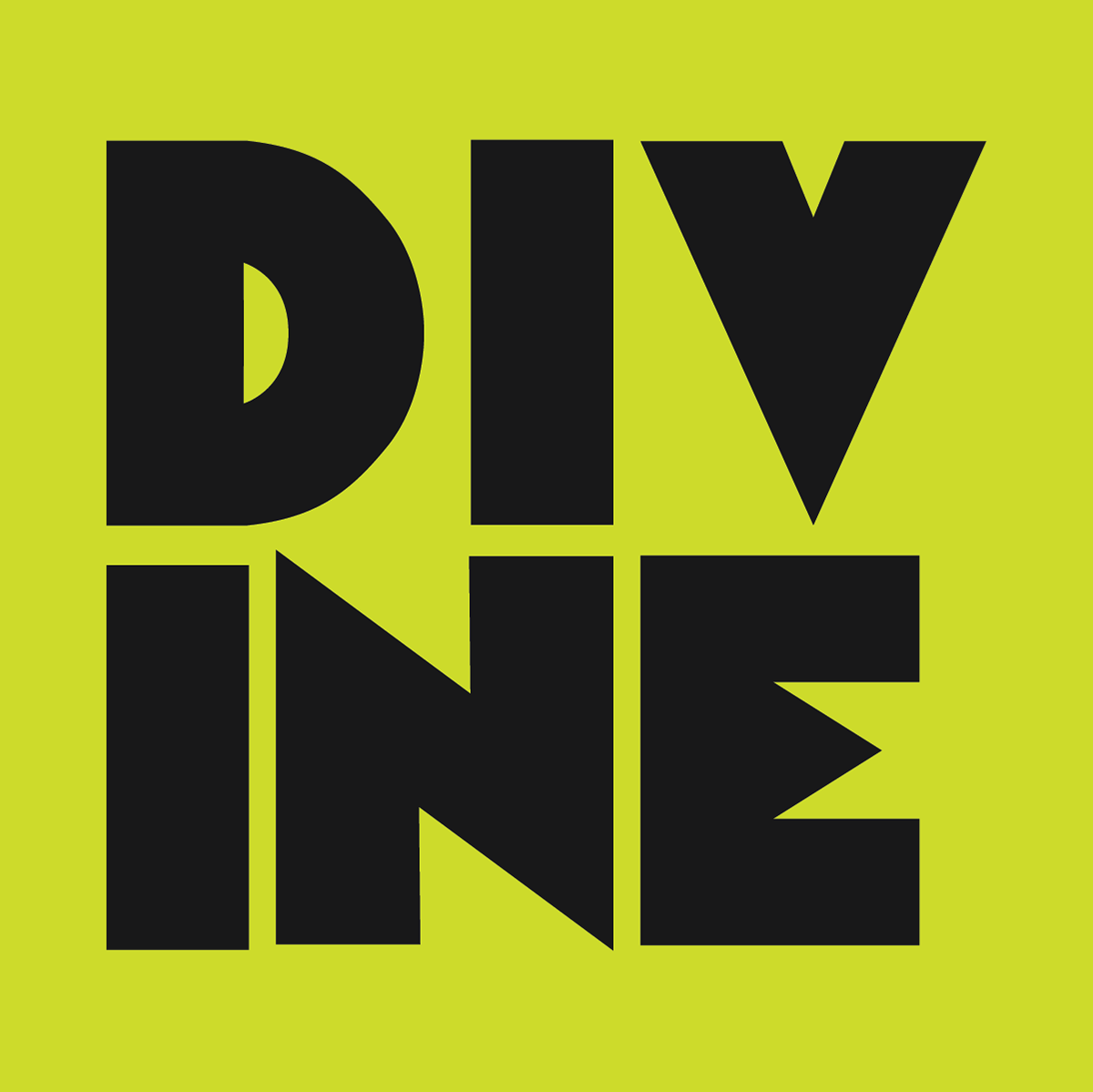
I created a logo and name for this bold, messy, and unconventional brand, inspired by a zoo-themed font and the spirit of wildlife. The brand appeals to artistically unique individuals, drawing inspiration from Divine, a 70s drag queen known for her bold, provocative style. The name "Divine" was chosen to reflect the brand’s edgy attitude. I also explored neon 80s colors and smudged ink patterns that evoke a lively, messy night out, capturing the essence of the queer club scene from the 70s to the 90s. This brand is for people who want to stand out—colorful, fearless, and unafraid of judgment. They feel divine and otherworldly when wearing these products, embodying confidence and individuality.