PROJECT DESCRIPTION
The main goals were to develop brand identity and packaging. I was tasked with choosing an industry and creating a suitable brand within it. In the fashion industry, I designed a logo, set the mood, selected colors, created a poster, developed packaging, and built an app that reflected the brand. The project focused on UX/UI design and helped me understand the details of print production and customer interaction.
LEARNING LENS
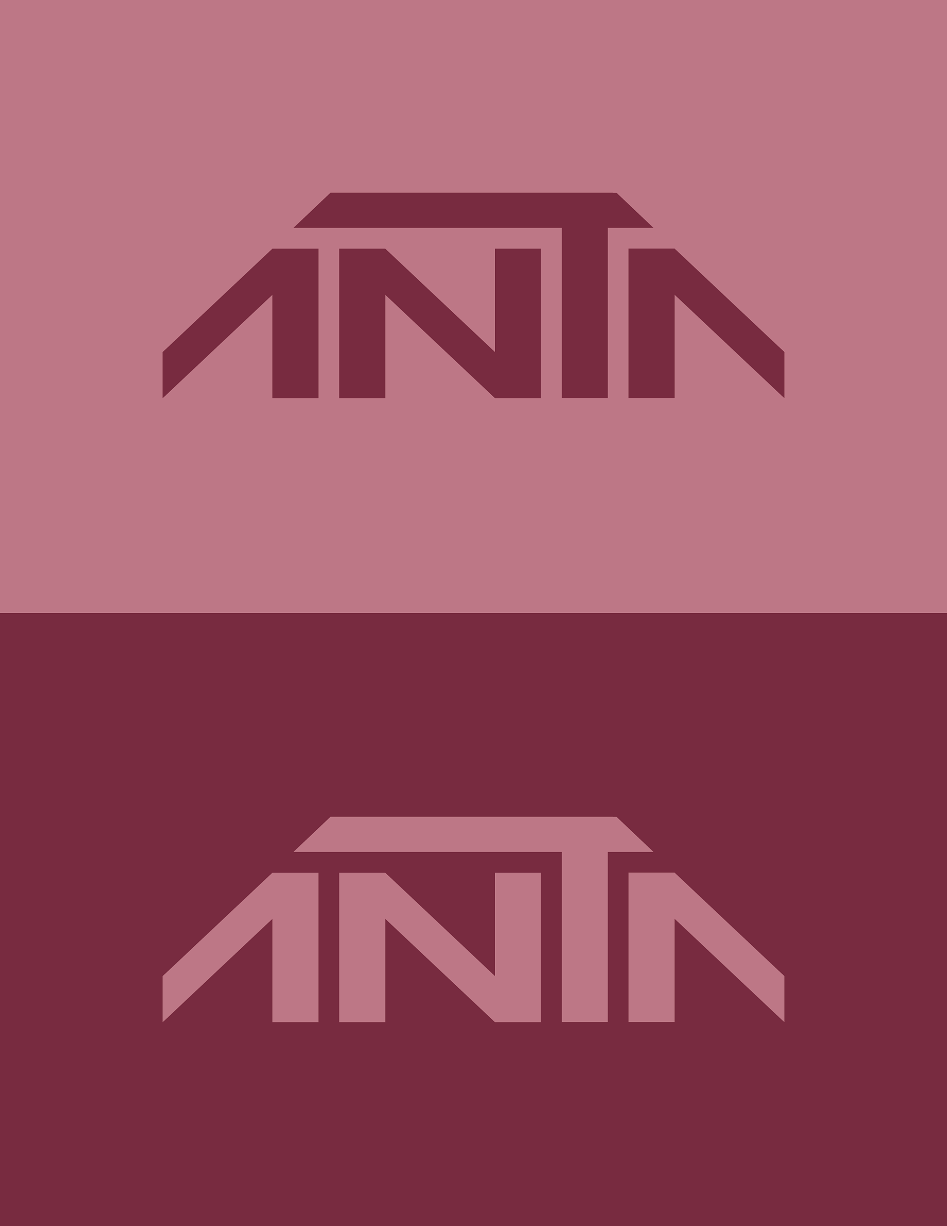
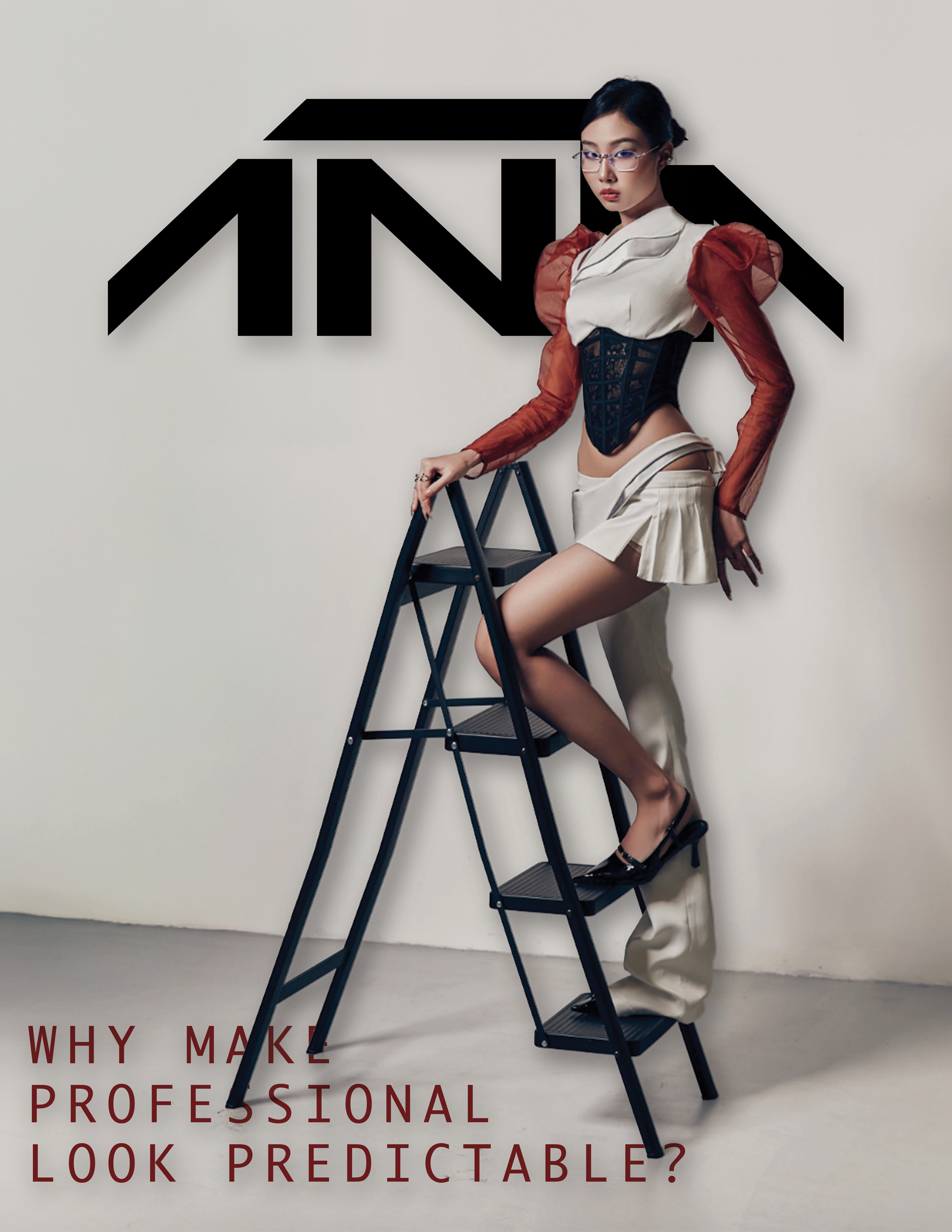
High fashion was the target when shaping this brand's identity. I chose the office wear route to highlight the seriousness of the corporate world and the limits on self-expression often found in such settings. Inspired by high-fashion brands and their sometimes impractical designs, I crafted this brand by combining corporate and unconventional elements to deliver an anti-establishment message. The brand name, “ANTA,” plays on its similarity to the word "anti." I aimed for a minimalist design, reflecting the simplicity of corporate life, while making the message bold and maximalist, challenging traditional luxury fashion standards.
FINAL SOLUTION
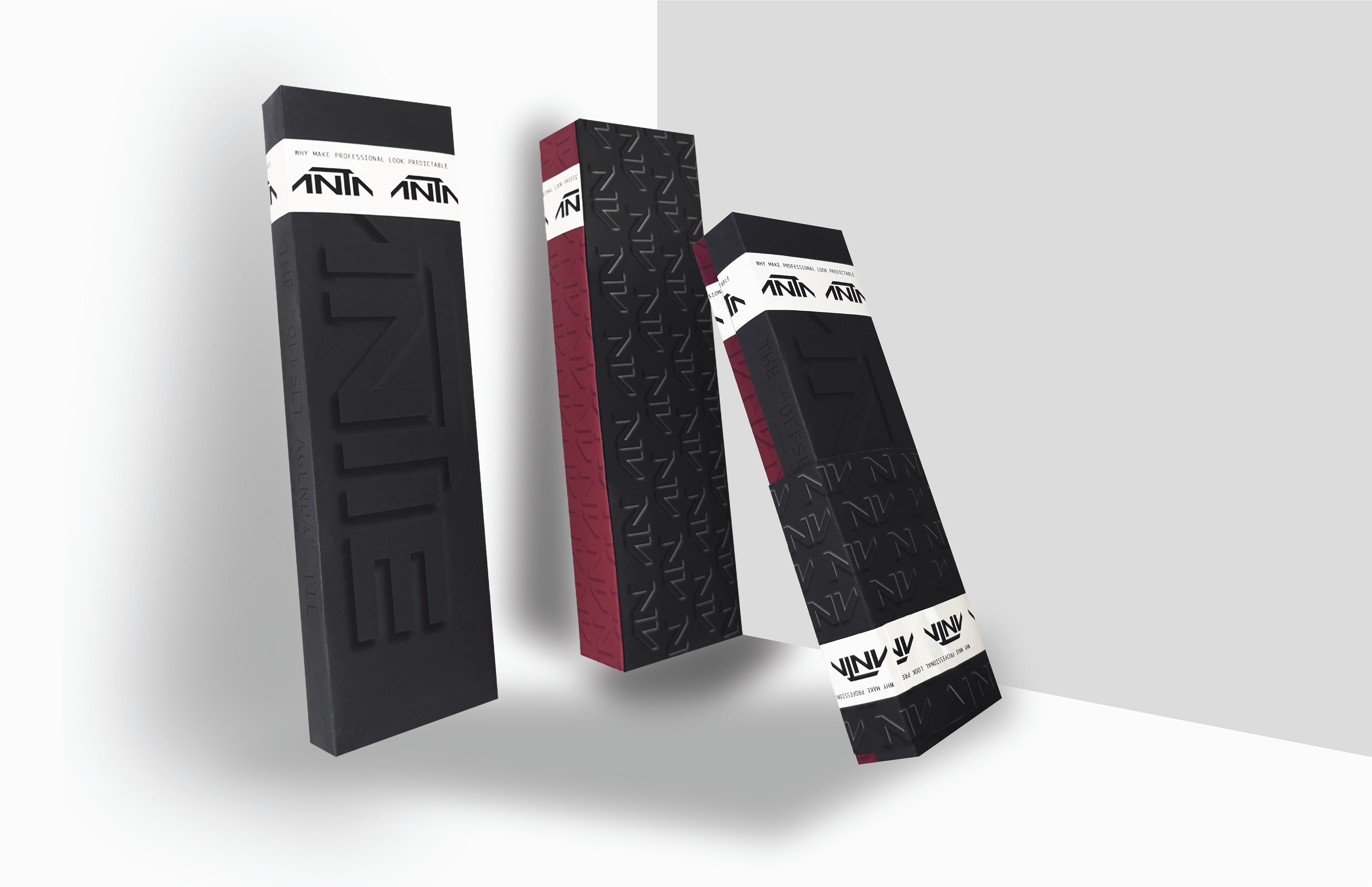
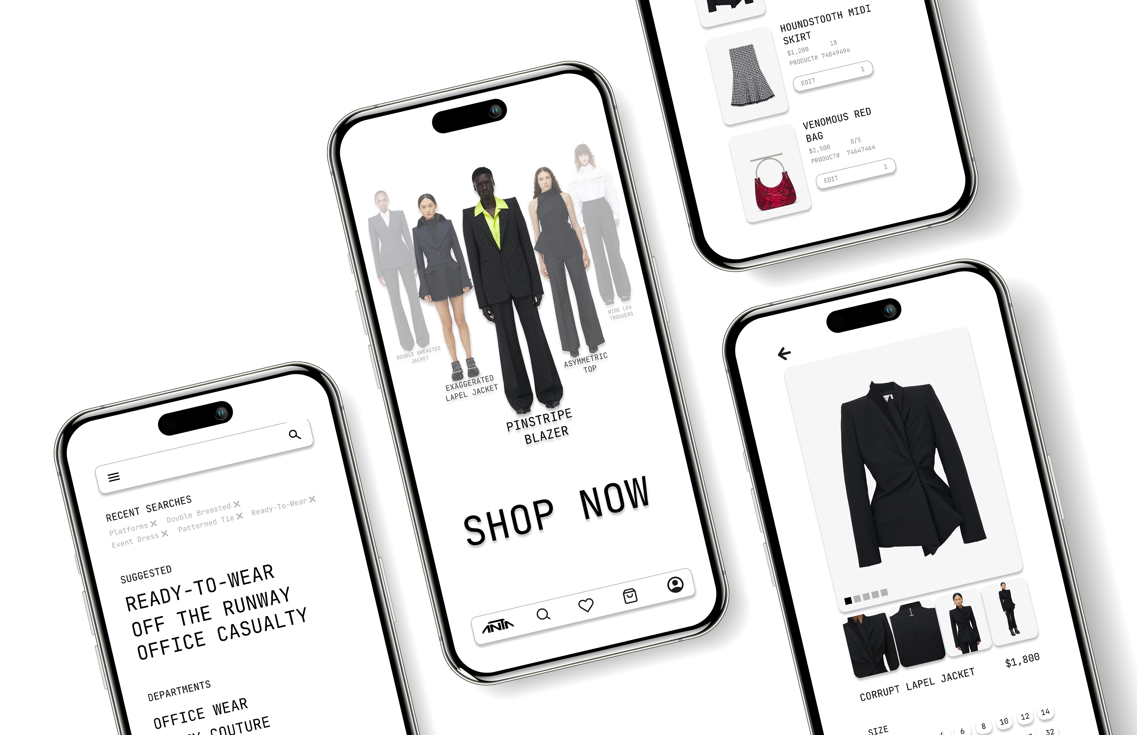
The custom typeface I created for Anta was the project’s centerpiece, representing the brand's futuristic approach to corporate wear. The slogan, “Why make professionals look predictable?” emphasized its sleek, minimalist style. This visual style was applied across physical formats, such as packaging—featuring a monochromatic de-bossed pattern—and digital platforms, including the app, ensuring the products stood out as the boldest element. The design aimed to subtly emphasize the brand's identity without drawing too much attention, thus highlighting its innovative spirit. ANTA represents a powerful, essential force for success, with the potential to lead in the future.